An Updated Mid-Century: Before And After
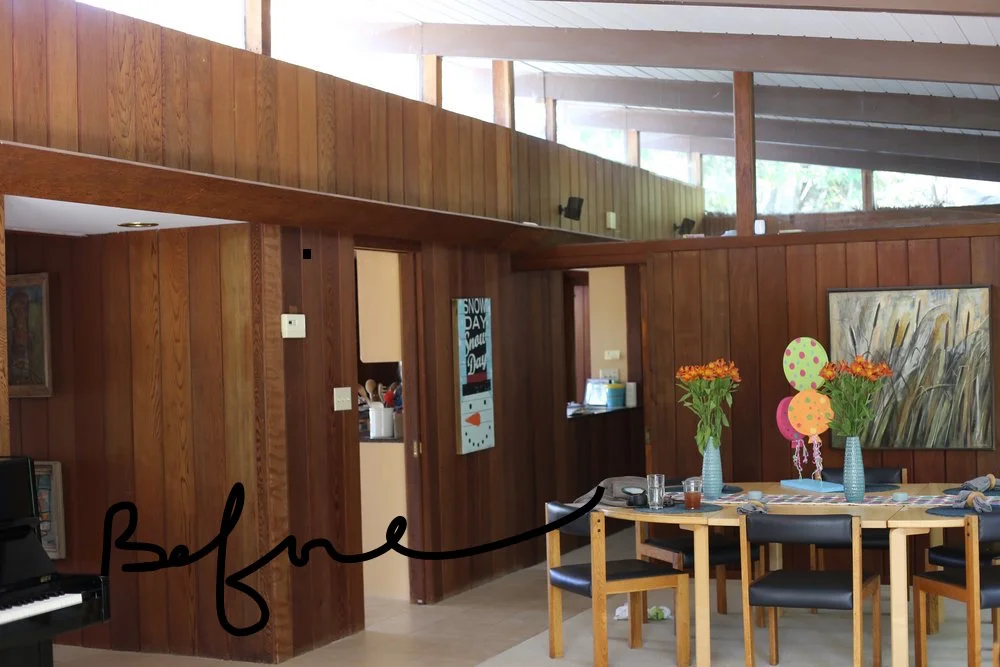
When I was asked to update and decorate this mid-century home, I will admit to have been quite excited. Living in a mid-century house myself, I'm well aware of the characteristics and materials used during that era and have grown to appreciate and love them. Themselves fans of the architecture and design of the time, my clients wanted to honor them as well, without completely appointing their space purely with iconic period pieces.
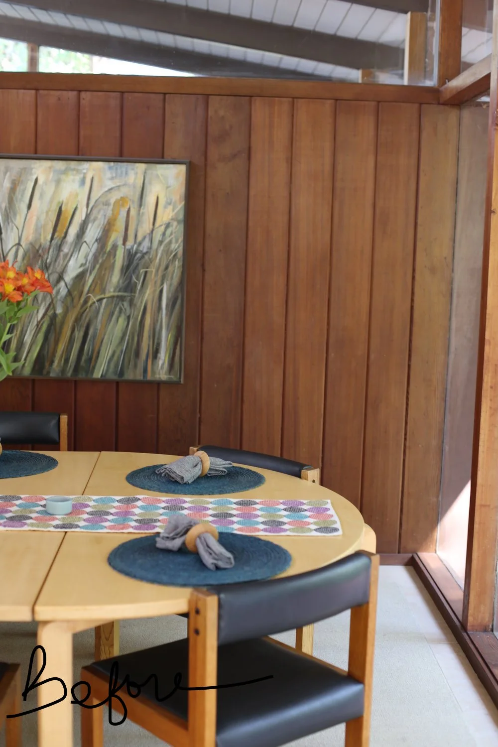
We first focused on the living room, dining area and entry way. A furniture layout was created to give the space better flow and plenty of seating for family and friends. With the use of textiles and color, we brought those areas together for a fluid, cohesive feel. Heath Ceramic wallpaper was hung in the entry to brighten it up. Clean-lined contemporary furniture, carefully curated accessories (mostly their own) were added to the living areas and focal lighting was installed. Presently, the home represents the clients' aesthetics while preserving their home's mid-century appeal.
Heath Ceramic tiles and sheet rock replaced the brick fireplace as a dramatic update, creating a true focal point for the space.
Moroccan poufs flank the oversized coffee table for extra seating, while a black and white ceramic stool doubles up as an additional surface.
Two matching occasional chairs found at a consignment shop await reupholpstering.
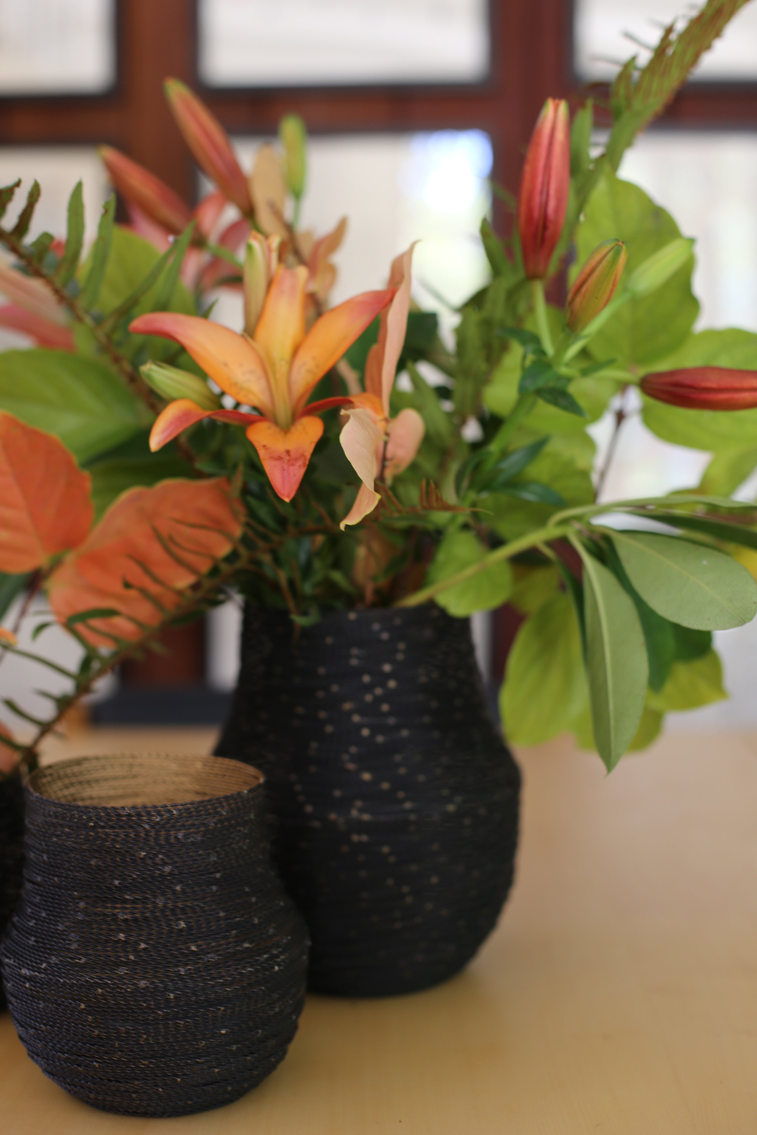
Botanicals placed by the glass walls bring the outdoors in and lend an organic atmosphere.
Vintage prints my clients brought back from a trip to Japan, were hung 'gallery' fashion in the dining room, creating depth and interest in the room.
Thank you BP and JP for allowing me the opportunity to work with you on your beautiful home.


