Room Inspiration: Our Home Office
Borrowing ideas from these 7 images, I put together this room inspiration for our home office makeover [which is almost finished]. The new look combines metals, textures and colors from different eras. The walls have been painted a metallic gold, the cabinet hardware has been replaced, a graphic rug has been added and two vintage leather & chrome chairs flank the built-in desk. I'm anxious to show it all to you, but we're still deciding on a few key details. The new look has already proven to be a productive and inspiring workspace for both Alex and me. Stay tuned for the big reveal.
Have you made any home improvements lately?
Images: light, mural, rug, drawer pull, desk, and chair
The Way We Work: Holly Bender Interiors
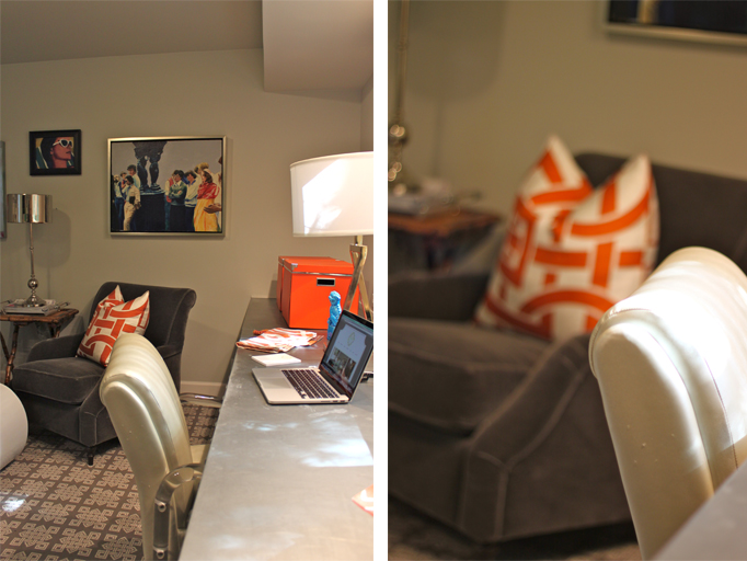
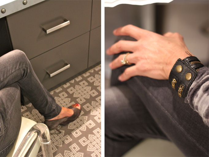
Last week, I had the opportunity to meet with Holly Bender of Holly Bender Interiors here in Lafayette, CA. During my visit we talked about design while I shopped her collection of art and vintage finds. I found a perfect piece for my office AND I got to photograph her home office as well. By combining lucite, mixed metals and patterns, pops of color and vintage [one of kind] pieces Holly created a work space that is sophisticated, glamourous and functional. Take a look:
To see more of her work click here.
Thank you, Holly, for sharing your inviting work space with Cocoon Home Blog readers.
The Way We Work: Vera Abud Interiors
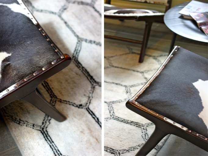
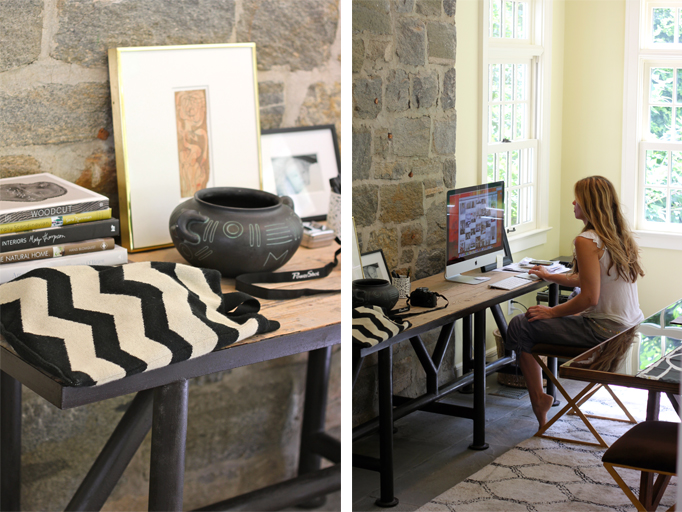
It's with great pleasure that I share with you the atelier of interior stylist Vera Abud. I've admired her style and approach to design and styling for a long time and am excited that she is now offering her talents to many through Vera Abud Interiors. While visiting her and her family in CT, we had the chance to talk about her new venture and to photograph her work space. I love the way she combined Moroccan textiles, cowhides and brass accents to honor both traditional and modern design.
During our time together she showed me a project she's currently working on. Needless to say, I brought my camera along so that I can show you what she's up to for future posts. In the mean time, take a look at a past project here. I'm sure you'll be hearing more about her.
Clever and Stylish Storage
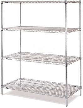
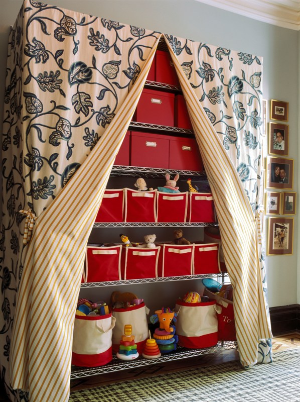 This is so cool. Metro shelving completely decked out to be both functional and stylish. It's a simple and effective way to create storage when actual closet space is limited or non-existent. Check out how easy it is to put it all together:
above images: Decorati
Metro shelves are available at most hardware stores and Amazon.
The Land of Nod and Bed Bath & Beyond have lots of canvas totes' colors to match your particular scheme.
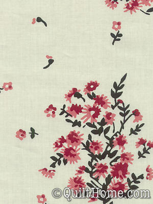
I love the geometric pattern on Denyse Schimdt's cranberry voile fabric. Line the inside of the curtain in a soft botanical print for contrast.
Looking through fabric samples is one of my favorite things to do. Quilt Home is a great web source for unique patterns and color combinations. While searching for the red version I found some blue fabric that I loved just as well. Take a peek at how this color storage story would look:
Who would have thought that being organized could be this stylish?
Cool News and Cool Work Space
Over the weekend we had the pleasure of having brunch with Brooke Richard of Orange Street Design Studio and her husband, David Gerzof of Big Fish Communications. It was a creative and lively chat about interior design, furniture concepts and blogging. I'm delighted to announce that Brooke will be an occasional guest blogger. Having collaborated with her in the past on several design projects, I know and value her sense of aesthetics. Brooke's knowledge and love of design will be an exciting addition to Cocoon's blog.
For a taste of her style, take a look at the shared office she and her business partner created for Orange Street Design Studio and Big Fish Communications. It's a mixture of grainy textures, earthy tones and shiny finishes. (And yes, husband and wife share this awesome work space!)
All photos: Eric Roth
Dark wood floors contrast with a light wood sliding barn door that welcomes you into the space. The wood for the doors was sourced from Longleaf and constructed by Loki Design.
The light filled conference room is warm and welcoming for both clients and co-workers. Touches of botanicals liven the space up while a wall stencil pays tribute to the business of PR.
The stencil was inspired by an open newspaper (torn edges included). Adhering the stencil was time intensive but the result was very worth it.
The second floor is where Orange Street Design Studio lets its ideas flow. Venting skylights provide plenty of natural light and good air circulation for the work environment.
To see more of Brooke's and Orange Street Design Studio's work take a look at "a most relaxing bedroom" and visit their website.
instagram ◈ twitter ◈ pinterest ◈ facebook
Debra Cass Szidon
Lover of layered neutrals, mixed patterns, contrasting textures and all things botanical. My creative energies pull me in many different directions but I’m most grounded as an interior decorator, handbag designer and mother. Cocoon Home blog is where I share my reflections on family, work and my creative journey.
All content and images are property of Cocoon Home unless otherwise noted. You are welcome to use images from the blog for noncommercial use, but please credit appropriately.
