Fund Raising Design: Lafayette Juniors Kitchen Tour May 14, 2016
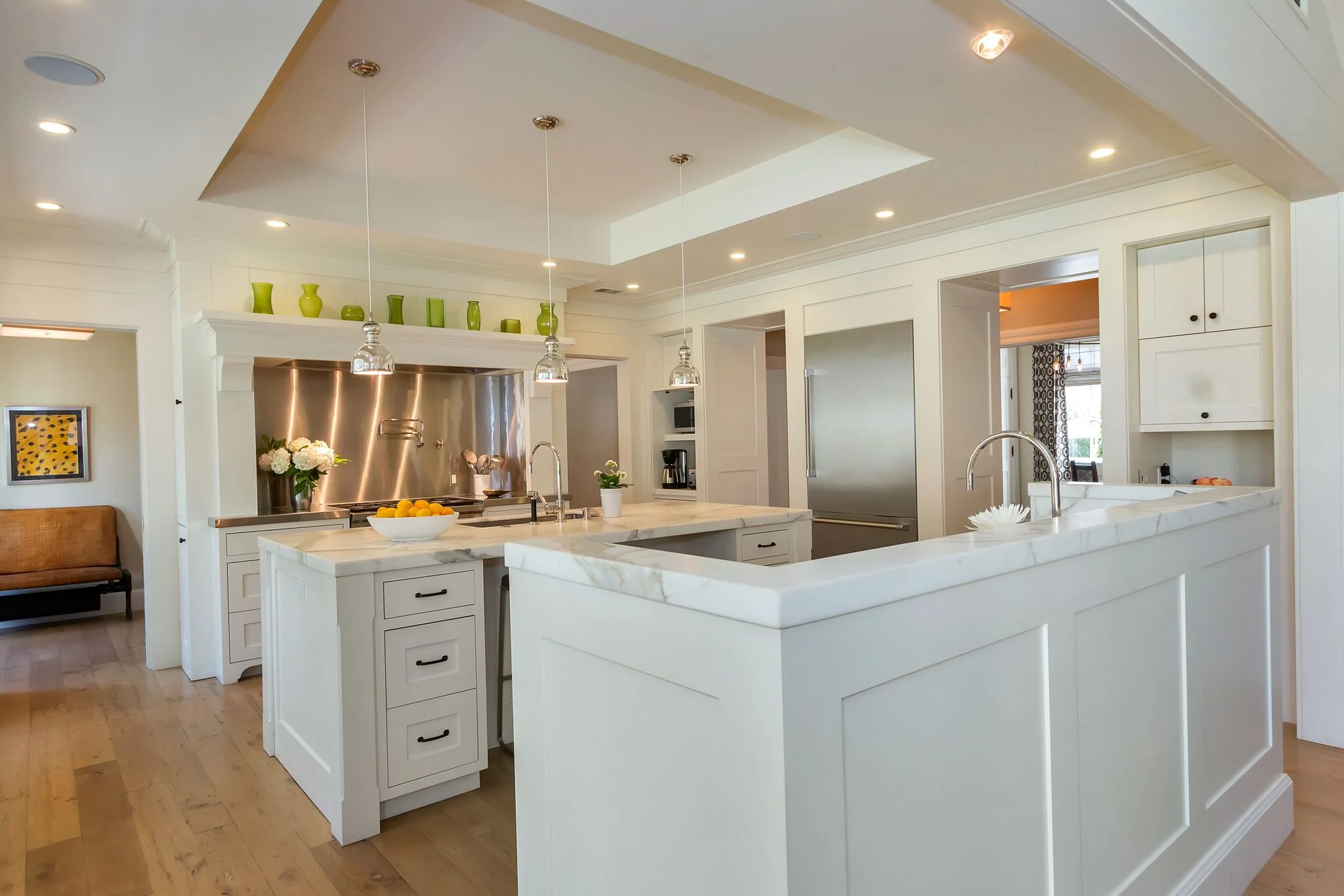
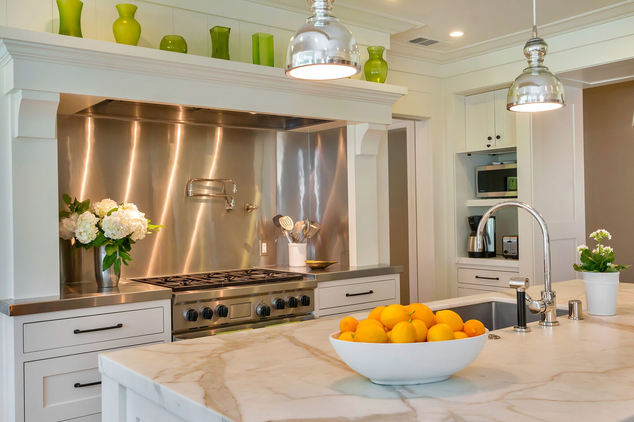
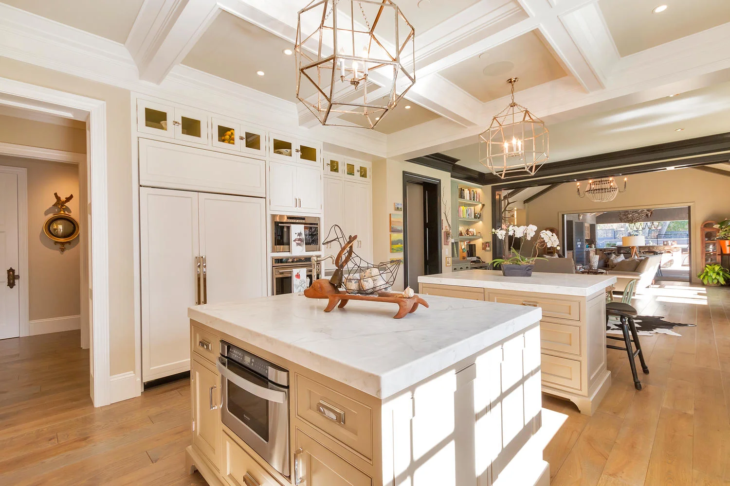
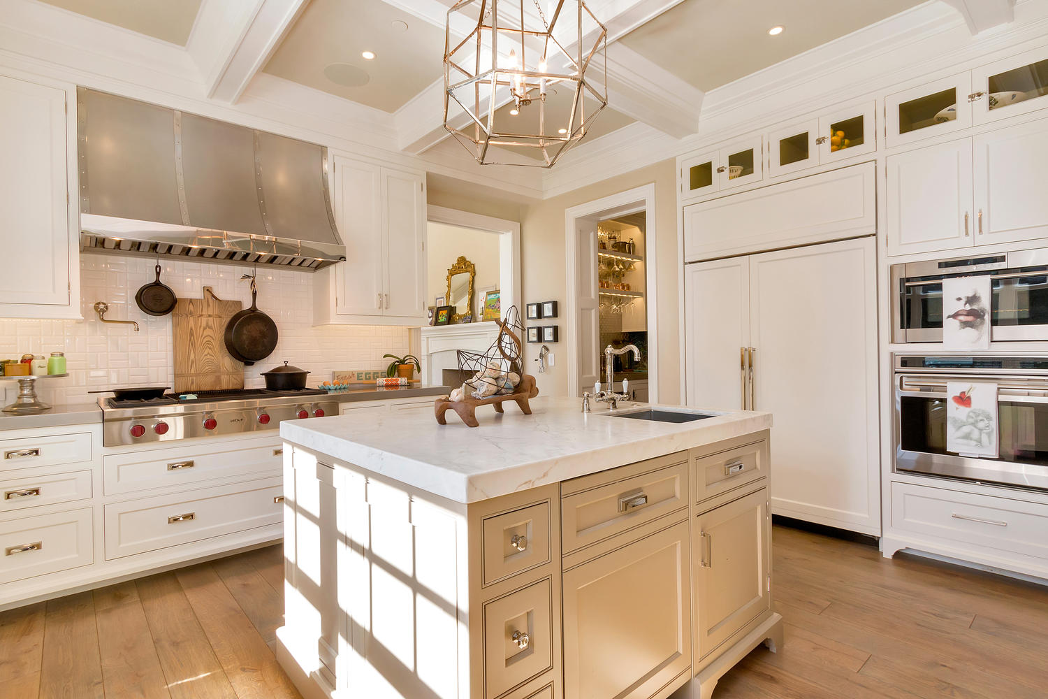
It's that time of year again when Lafayette Juniors hosts its annual Kitchen Tour. Last year, the non-profit organization featured our newly renovated kitchen. It was an honor to be part of such an amazing fundraising event. Not only does one get an chance to view some amazing kitchen designs to inspire one's own, but it's also an opportunity to support one's local community. The proceeds from the ticket sales benefit local organizations that provide exceptional support for families, children and seniors living in the Contra Costa county areas. This Saturday, May 14th, is the group's 17th tour.
Tickets are still available. For more information click here. In the meantime take a sneak peek at two of the five homes featured this year.
Get a group of your friends together and join the tour. It's a great way to spend a Saturday and give back at the same time!
Fund Raising Design: Lafayette Juniors' 16th Annual Kitchen Tour
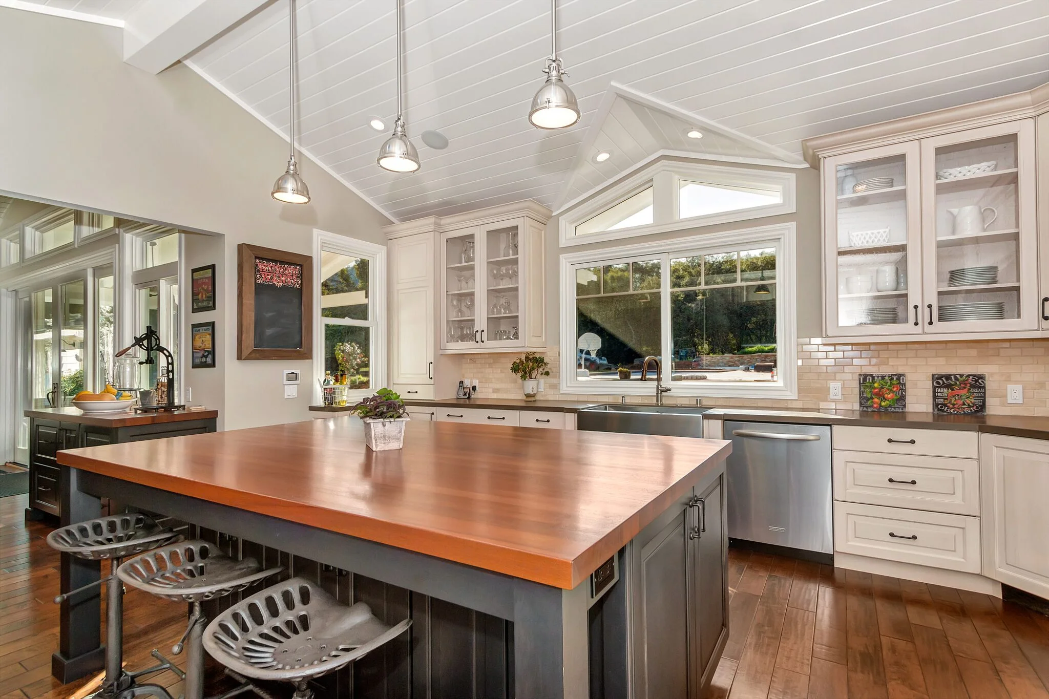
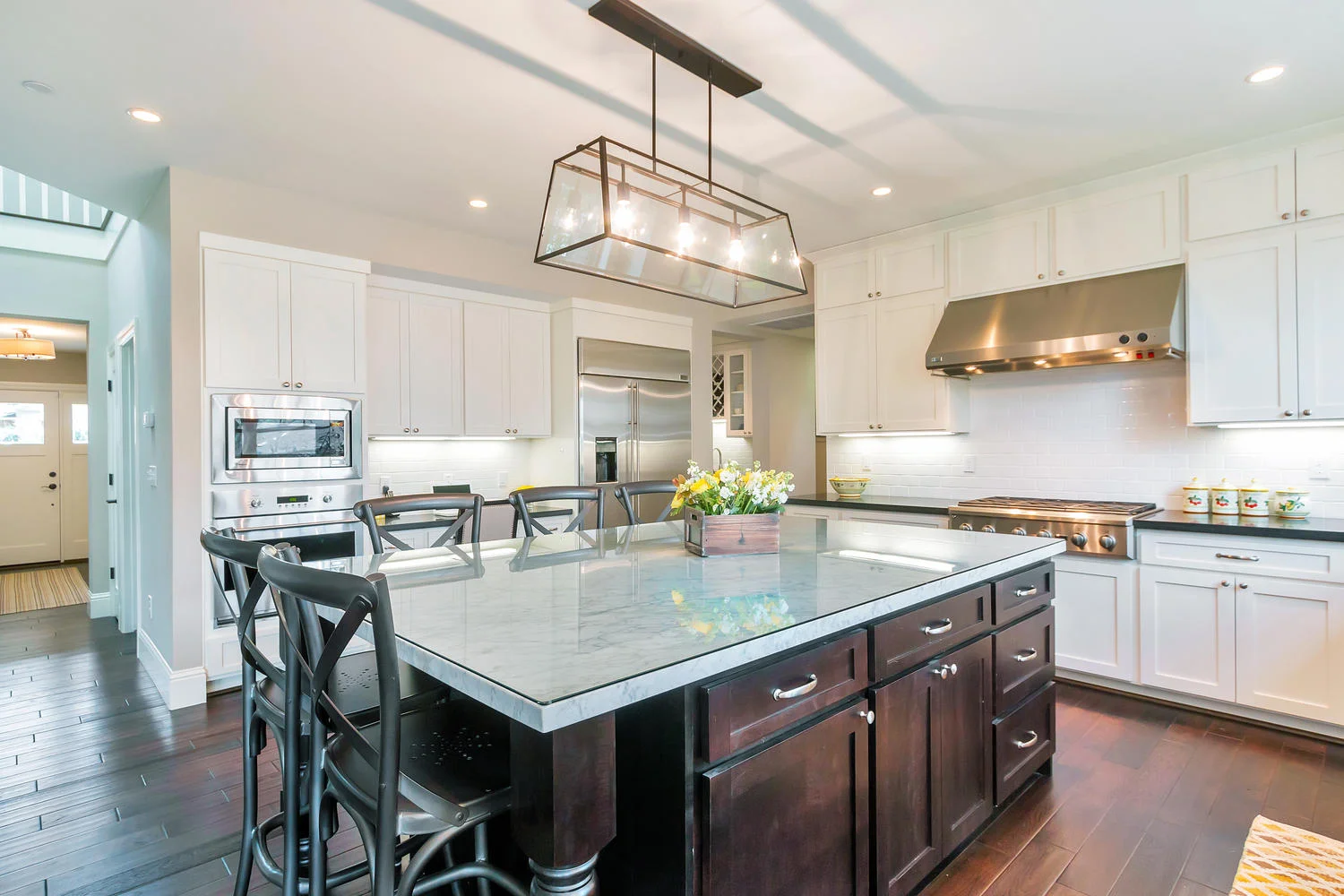
Next Saturday, May the 16th, Lafayette Juniors will be hosting its 16th annual Kitchen Tour from 10am to 3pm. Ours will be one of the six featured. This event provides a great opportunity to acquire design inspirations and also to give back to our community. The ticket proceeds benefit local organizations that provide exceptional support for families, children and seniors in the Contra Costa and East Bay communities. We're honored to be part of the Lafayette Juniors largest and most successful fundraising event. For more information on the tour and ticket sales click here.
In the mean time, here's a sneak peek at 3 of the chosen kitchens.
Kitchen Update: The Table Top
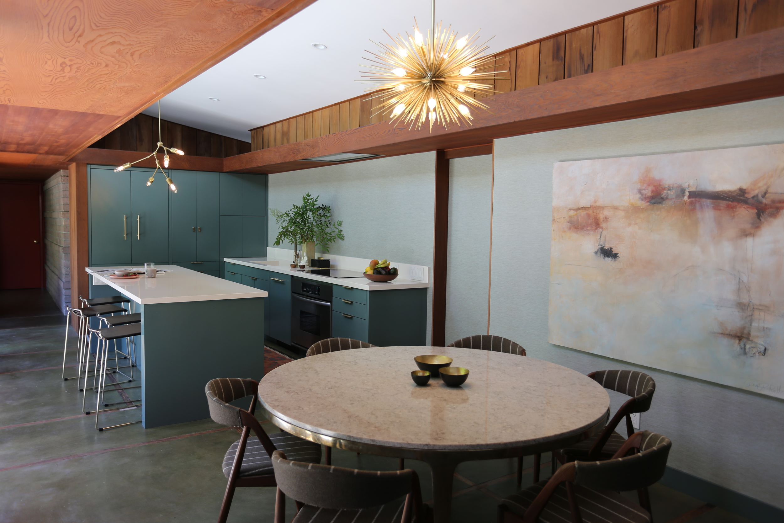
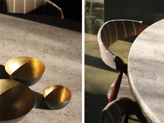
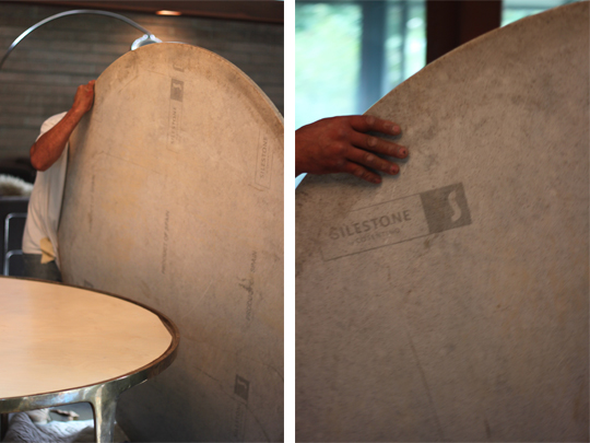
 At last, our dining room table is completed. Using the same material as we did for our counters, Silestone, but in a different color, we were able to blend our two kitchen areas without making them look too 'matchy-matchy'. A solid creamy white called Haiku for our counter tops lent a more modern look in the kitchen, while the marbled effect of Quasar for the table top gave the dining room a more traditional feel. The combination works perfectly together. We're loving the look and the durability of the stone and, in all honesty, we're finding ourselves sitting around the table longer. Eating slower, chatting longer and entertaining more often. The renovated kitchen has become the heart of our home. Take a look:
It's hard to believe that it was almost a year ago that we were finalizing the renovation plans for our kitchen and only now do I feel it's almost done. It was well worth the time invested and I thank all who've been following this [at times] arduous process. In the future, I will share my art search for the dining area and for fabric to reupholster our comfy chairs. I will need your help again.
Did you really think we were done?!?
Kitchen Update: And The Winner Is...
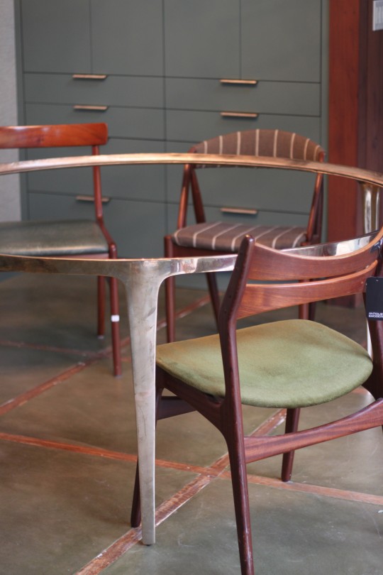
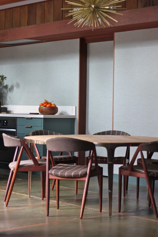
 We made the decision and the Kai Kristiansen chairs are here to stay! Their angled legs and recessed backs complement the elegant base and brass finish of our Barbera table. Not to mention the fact that they're uber comfortable and period appropriate for our home. Now there's a clear balance between the kitchen's modern renovation and our home's authentic mid-century design. Take a look:

 Up next is the table top and some [large art]. The dining area is taking a while to come together, wouldn't you agree?
Many thanks to the readers who expressed their opinions on the chairs. I really enjoyed reading all the comments!
Kitchen Update: Deciding On Chairs
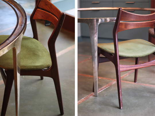
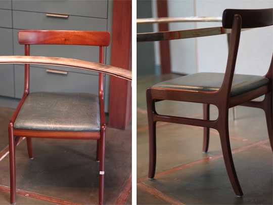
 Last Saturday, Alex and I set out to find chairs to place around our new dining table. After visiting a few Mid-Century shops we found 5 period appropriate contenders, all of which came with us overnight. After studying the chairs, both from near and afar, we were able to narrow the options to 3. One designed by Eric Buch, another by Kai Kristiansen and the third by Ole Wanscher's. Taking in account their comfort, shape and wood grain all 3 could work in the space and the table but only ONE can stay. I have my favorite. Which one is yours?
1. Eric Buch
Many thanks to the folks at Modernaire, Antiques and Modern and Klassik Living for working with us!
instagram ◈ twitter ◈ pinterest ◈ facebook
Debra Cass Szidon
Lover of layered neutrals, mixed patterns, contrasting textures and all things botanical. My creative energies pull me in many different directions but I’m most grounded as an interior decorator, handbag designer and mother. Cocoon Home blog is where I share my reflections on family, work and my creative journey.
All content and images are property of Cocoon Home unless otherwise noted. You are welcome to use images from the blog for noncommercial use, but please credit appropriately.


