Client Update: #beaconhillchd
 For the past year I've been working with clients in Boston. At first, we gutted their Beacon Hill condominium to update the utilities, raise the ceiling, refinish the floor and restore some of the residence's architectural details. Over the summer I had the opportunity to begin decorating the home and I'm flying East tomorrow to continue the process. We'll be adding rugs, accessories, accent pieces and, of course, some indoor botanicals. Follow my search as I Instagram potential items for this project at #beaconhillchd. It will be fun to have you along!


Client/Friend Collaboration
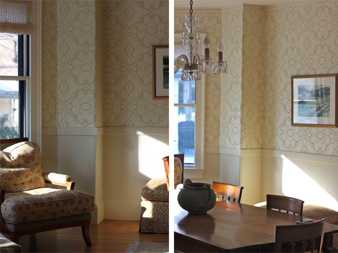
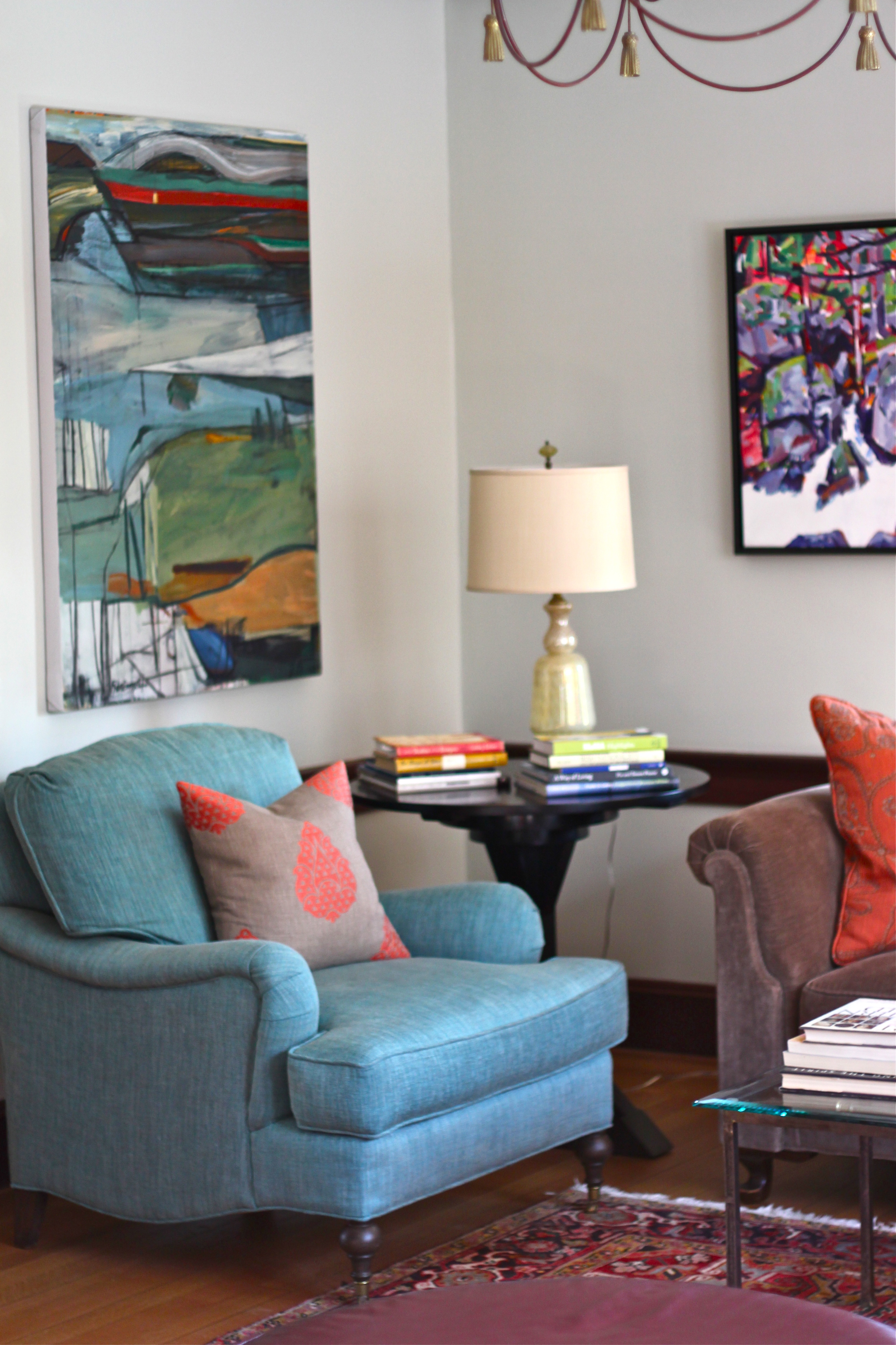
 During my stay in Cambridge last week, I did spend a few nights at a friend's home (who had also been a client) and was reminded of how much I enjoyed working with her. Because our styles are so different, we challenged each other in areas that were out of our mutual comfort zones. Where I tend to be more miminalistic and tonal in color preferences, my friend has a more classic and traditional approach to decorating with bolder colors and prints. Together we collaborated in bringing together a mix of textiles and patterns that resulted in a refined, transitional space. The images below tell the story.
Thank you EVB for giving me the opportunity to work together on your beautiful home.
Kitchen Inspirations: A 3rd Option And YOUR Favorite is?
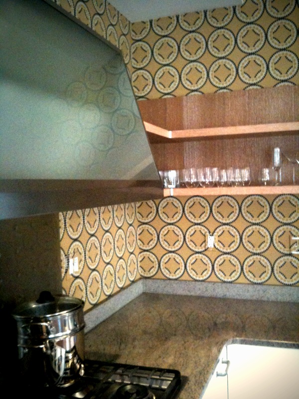
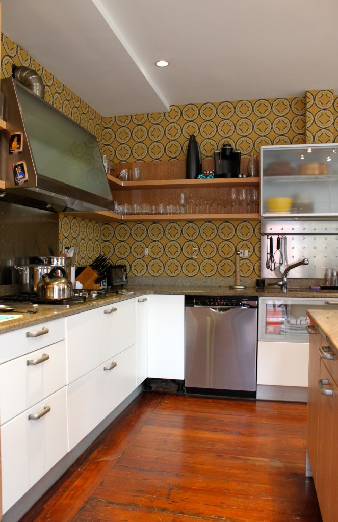
 Here's one last 'look' for our upcoming kitchen renovation and I really would like to know which one YOU favor because I am strangely undecided. The first look was inspired by the wallpaper. I love its bold pattern and color combo. It's fun and it's modern.
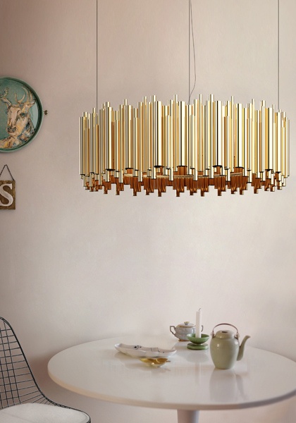
The second combines texture and sheen which are both sophisticated and elegant. This look would contrast the redwood panels that line the interior walls of our house very nicely.
The third 'look' is earthy and warm and honors the mid-century design of our home the best. The blues and greens in the wallpaper coordinate well with the green tones of our concrete floors and blend seamlessly with the redwood walls as well.
So do we go bold, elegant or earthy?!?
Which is YOUR favorite look and why? Help me out.
I just made our once private Kitchen Reno Pinboard public. Take a look at it here.
Before And After: Kitchen/Part 1
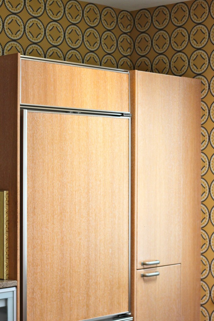
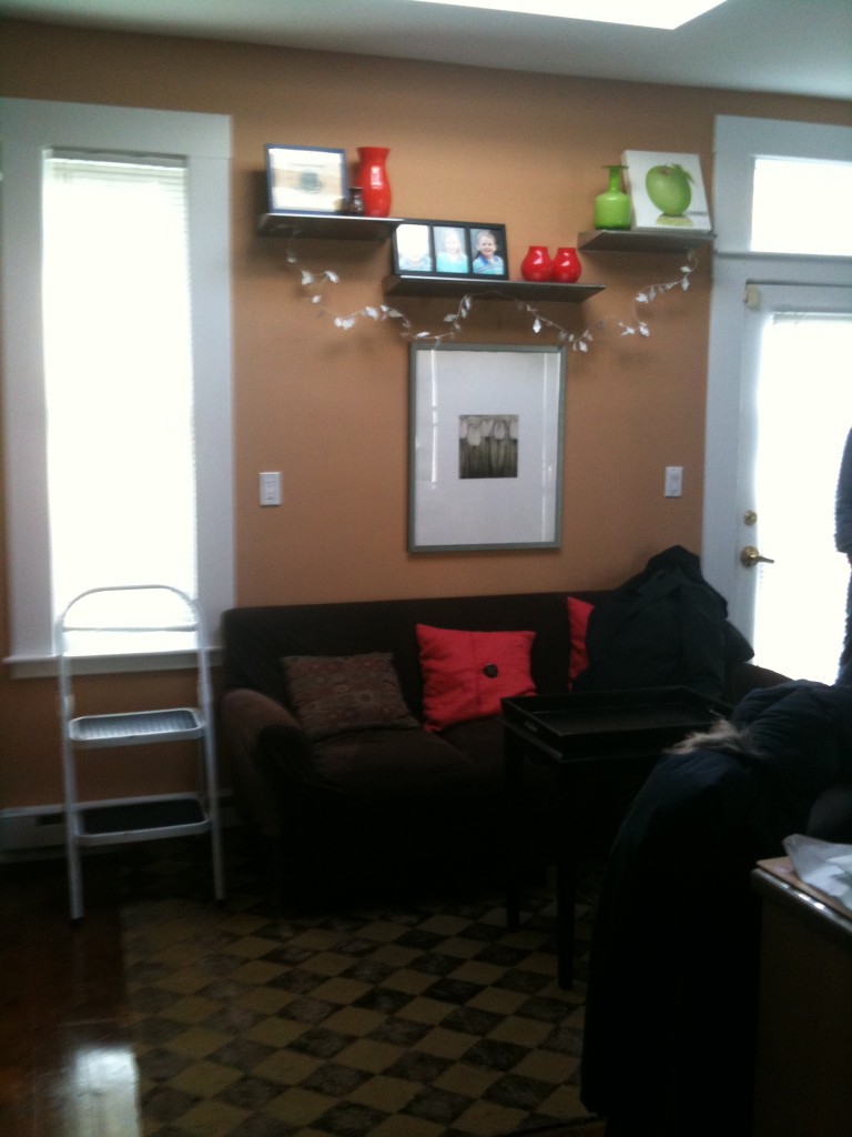
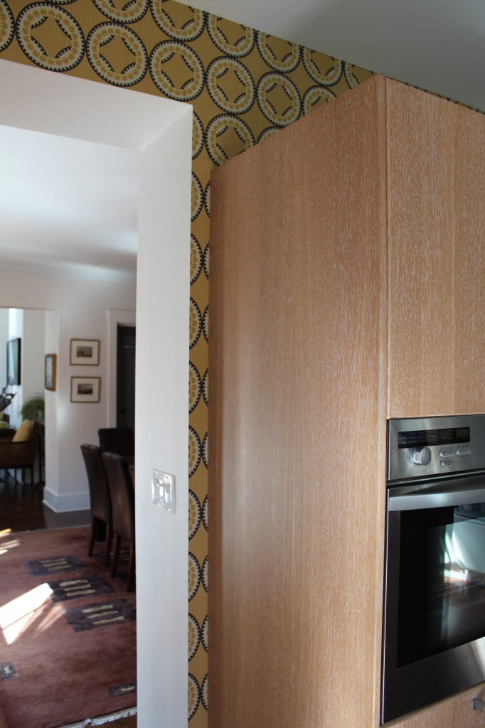
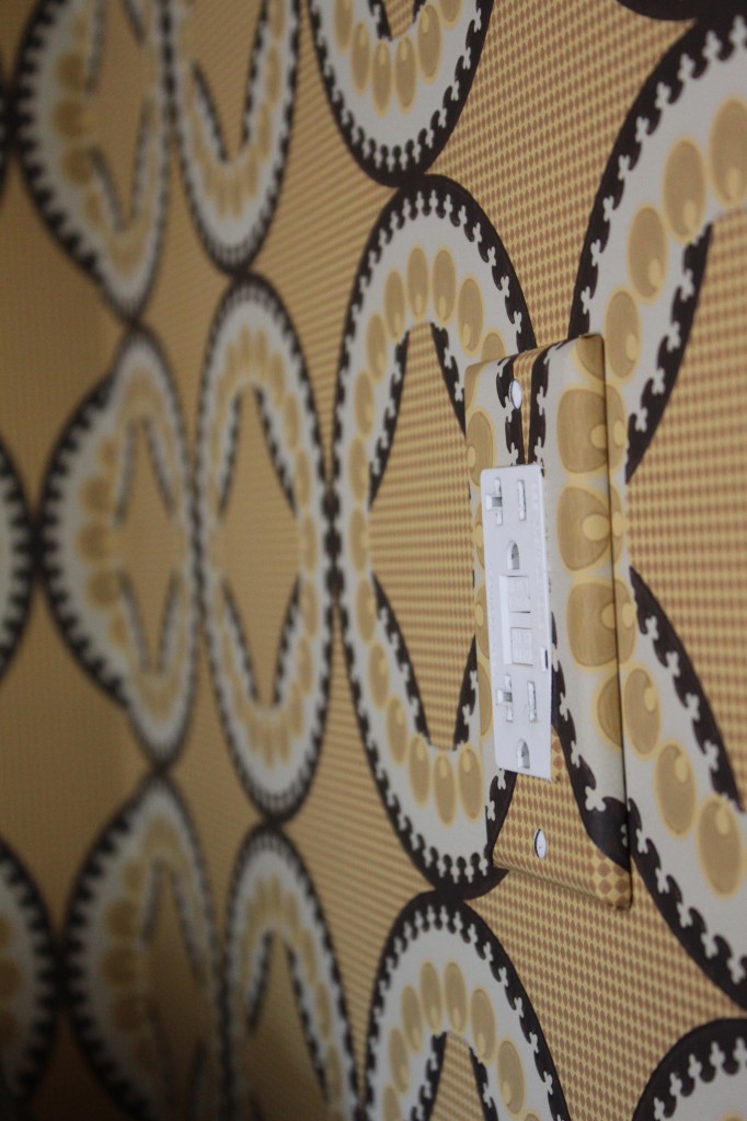
Part 1 of this Before and After reveals how Cocoon Home transformed a kitchen by repurposing its current furniture, editing and adding pattern and color. With a sofa and comfortable counter stools in place, this family of five kitchen doubles as a place to hang, do homework and read. Already well organized and outfitted with great cabinetry and counters, the space needed to be brightened and updated. Using Niesha Crosland's Moorish Circles wallpaper the kitchen area now takes on a whole new feel with a mix of bold color and pattern. Take a look at these before and after photos. Not only will Part 2 reveal how we managed to [aesthetically] add a mini mud room to the space, but also feature our next reader giveaway.
Stay posted for part 2 of this kitchen's makeover and reader giveaway!
instagram ◈ twitter ◈ pinterest ◈ facebook
Debra Cass Szidon
Lover of layered neutrals, mixed patterns, contrasting textures and all things botanical. My creative energies pull me in many different directions but I’m most grounded as an interior decorator, handbag designer and mother. Cocoon Home blog is where I share my reflections on family, work and my creative journey.
All content and images are property of Cocoon Home unless otherwise noted. You are welcome to use images from the blog for noncommercial use, but please credit appropriately.

