Kitchen Renovation: Part 2
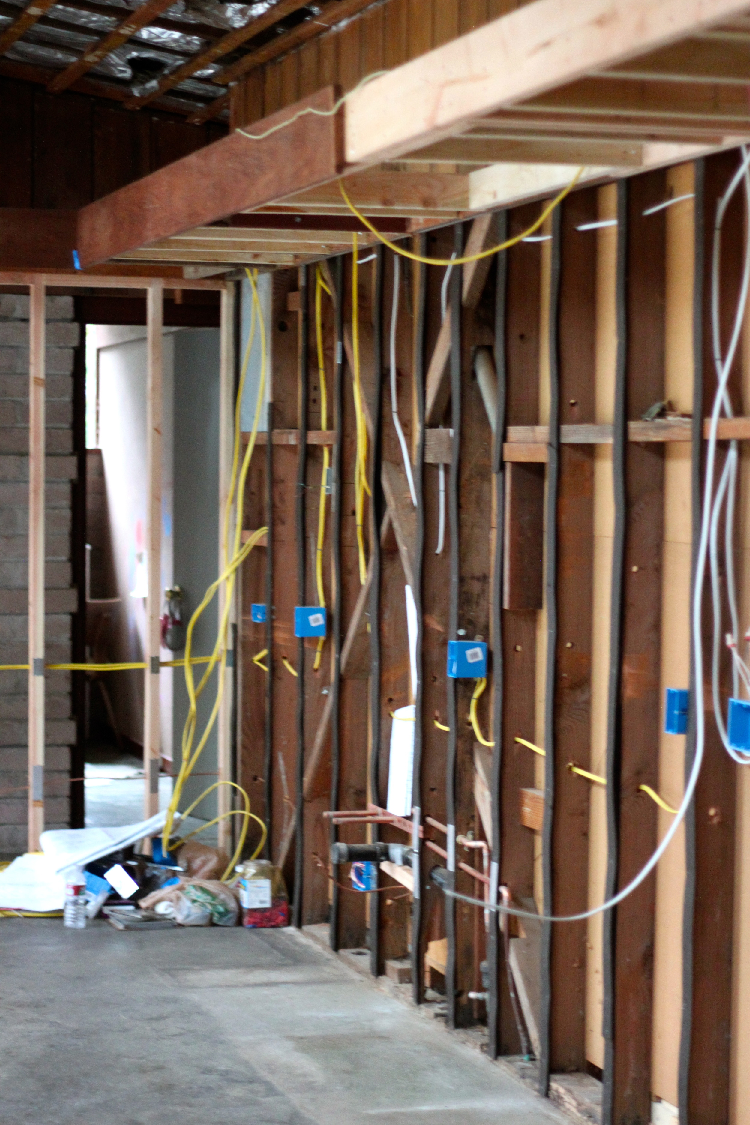
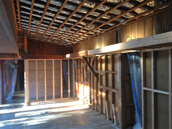
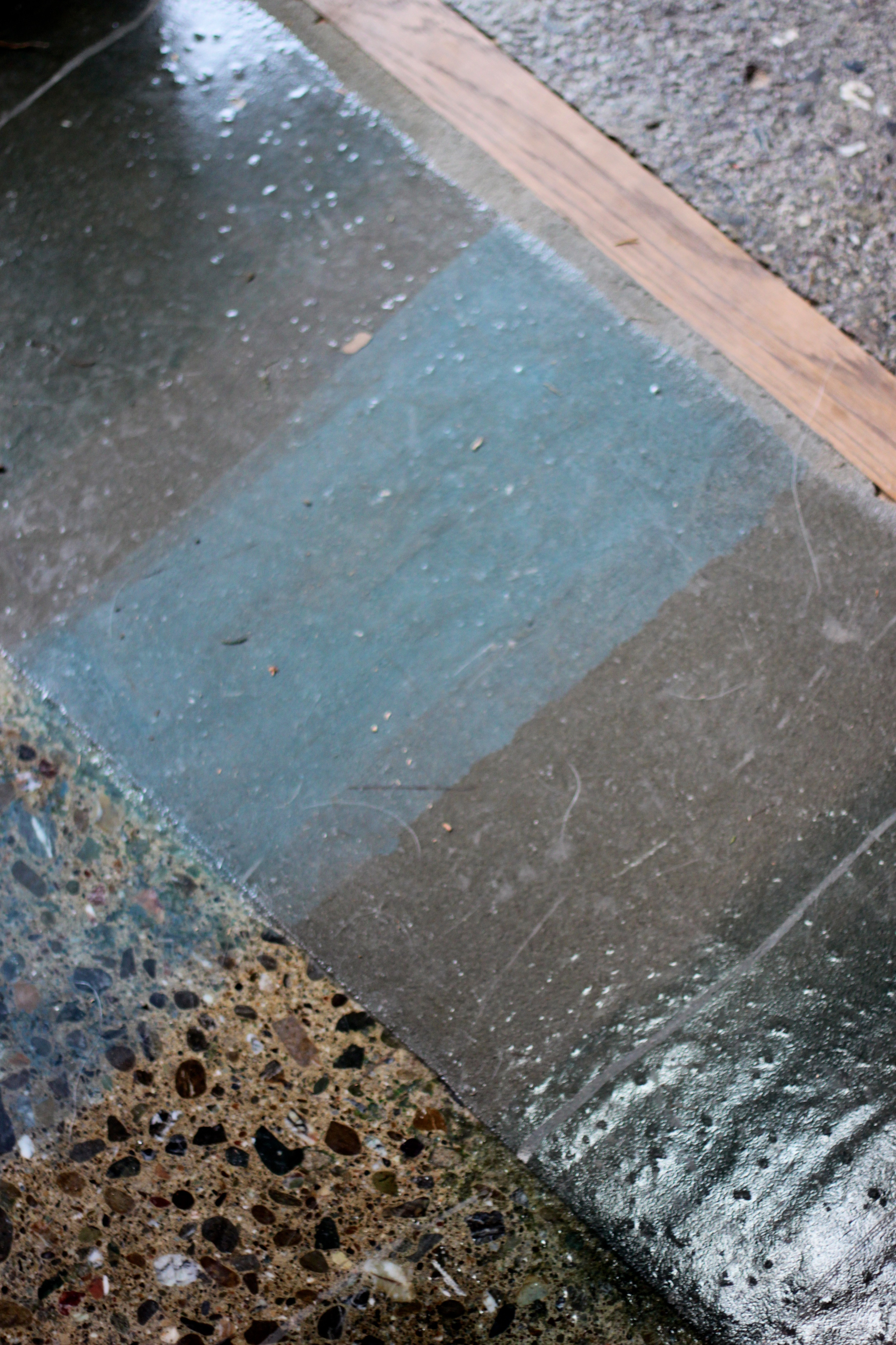
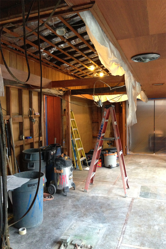
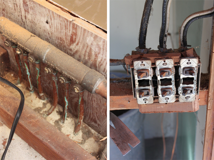
Now that the walls and ceiling of our kitchen have been exposed, new electrical wiring and boxes are being installed. The valances, so typical of Mid-Century design, have been preserved and in some areas extended. In case of any late night entertaining, we added a pocket door to separate the dining area from the hallway leading to the bedrooms. This so that those who tend to go to bed early (mostly me) can fall sleep easily. On Tuesday, the concrete floor affected by the renovation will be sanded, smoothed and tinted. Things are moving right along. Take a look:
Kitchen Renovation: Part 1
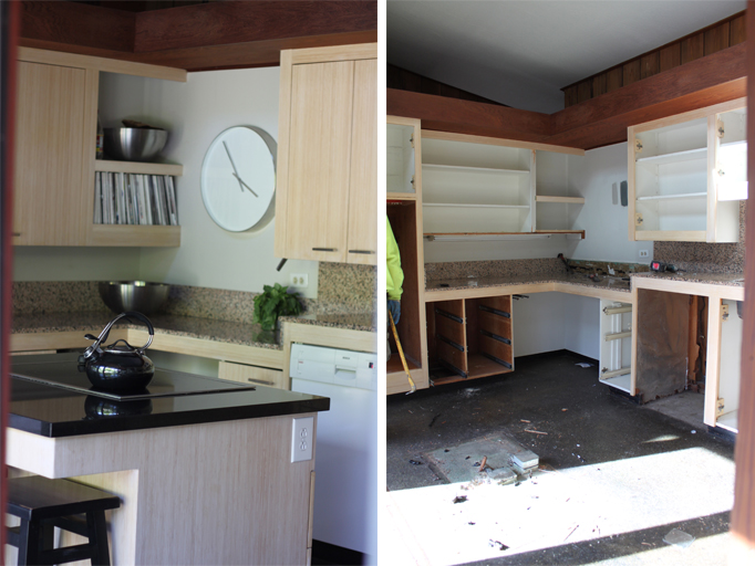
This Monday our kitchen renovation began. The somewhat confined space, featuring 3 different counter heights and an island at which not even a child could sit comfortably was demolished to reveal a more spacious area. The kitchen and dining room areas will be reworked so that cooking, eating and entertaining will become effortless. We are, of course, preserving the wood valances that are typical of so many mid-century homes, removing a center wall (complete with paneled door pass-through) and repurposing as much of the redwood as possible. Take a look at Part 1 of our "Kitchen Renovation" and stay tuned for more project updates.
Our kitchen is literally a main entry into our home. It is located in the center of the house surrounded by glass walls blending the interior spaces with the exterior courtyards, another major theme in mid-century modern designs. With the new kitchen layout, this connection to the outside will be even greater and also ensure a more welcoming entrance. I'm truly excited!
Thus far, this has been quite the week! With our kitchen project getting underway and the wonderful support my blog has been receiving on Apartment Therapy's The Homies Awards, I must admit to being overwhelmed at times. If you haven't voted yet and like Cocoon Home Blog please show your support by registering here and voting here. Thank you all SO much!
Decided On: Kitchen Inspiration
After much deliberation, we've decided to go with Kitchen Inspiration #3. I really enjoyed and took to heart the comments left on the last kitchen post where readers were asked to pick their favorite. Most did not choose #3, the earthier and, I will admit, safer scheme. However, we felt the need to honor the architecture of our mid-century home by keeping the decor somewhat understated. Don't feel too disappointed though, if you really know me, you can bet this kitchen will have plenty of "stand out" details.
Many thanks to Thorn Architects for helping us plan our upcoming kitchen renovation. We hope to get started in January. Stay tuned.
Kitchen Inspirations: A 3rd Option And YOUR Favorite is?
 Here's one last 'look' for our upcoming kitchen renovation and I really would like to know which one YOU favor because I am strangely undecided. The first look was inspired by the wallpaper. I love its bold pattern and color combo. It's fun and it's modern.
The second combines texture and sheen which are both sophisticated and elegant. This look would contrast the redwood panels that line the interior walls of our house very nicely.
The third 'look' is earthy and warm and honors the mid-century design of our home the best. The blues and greens in the wallpaper coordinate well with the green tones of our concrete floors and blend seamlessly with the redwood walls as well.
So do we go bold, elegant or earthy?!?
Which is YOUR favorite look and why? Help me out.
I just made our once private Kitchen Reno Pinboard public. Take a look at it here.
Obsessing Over: Agate
Ever since I placed an agate ashtray that's been in my husband's family for years on our coffee table (as a decorative object), I've been mildly obsessed with the stone. Its beautifully variegated colors and patterns are known to attract strength, protect from stress and ward off bad dreams. Take a look at some of the ways you can adorn your home and yourself with this beautiful gemstone.
instagram ◈ twitter ◈ pinterest ◈ facebook
Debra Cass Szidon
Lover of layered neutrals, mixed patterns, contrasting textures and all things botanical. My creative energies pull me in many different directions but I’m most grounded as an interior decorator, handbag designer and mother. Cocoon Home blog is where I share my reflections on family, work and my creative journey.
All content and images are property of Cocoon Home unless otherwise noted. You are welcome to use images from the blog for noncommercial use, but please credit appropriately.

