Kitchen Update: Dining Table And Stools In Da House!
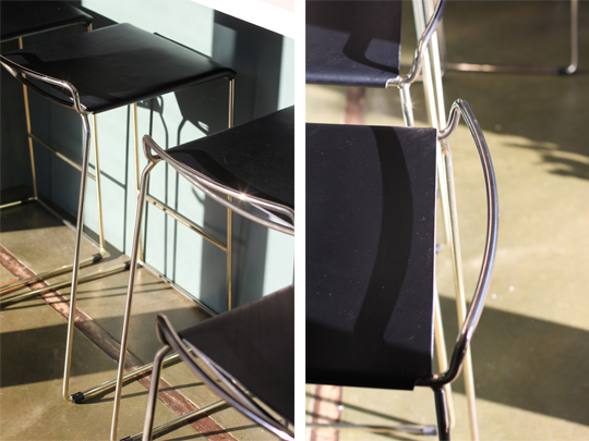
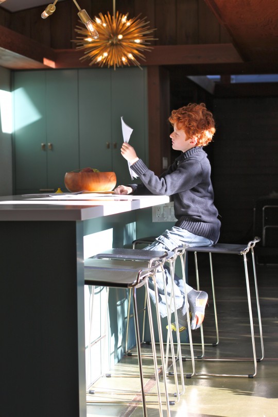
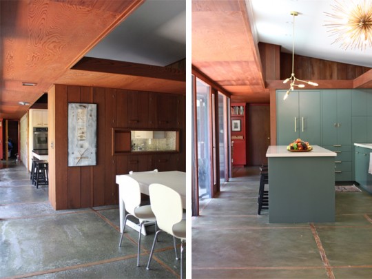
 Great news!! Our dining table and stools have arrived safely from Australia and they're even more beautiful than I had anticipated. The table base is just the right size for our dining area and it provides a bit of raw elegance to the space, while the stools pull the entire space together by virtue of their black leather seats and brass finish. Once I return from a week-long trip to the East coast, I'll be in full dining chairs scouting form. My guess is that I will need some serious 'blog reader' input with THAT decision. In the mean time take a look at these beauties:
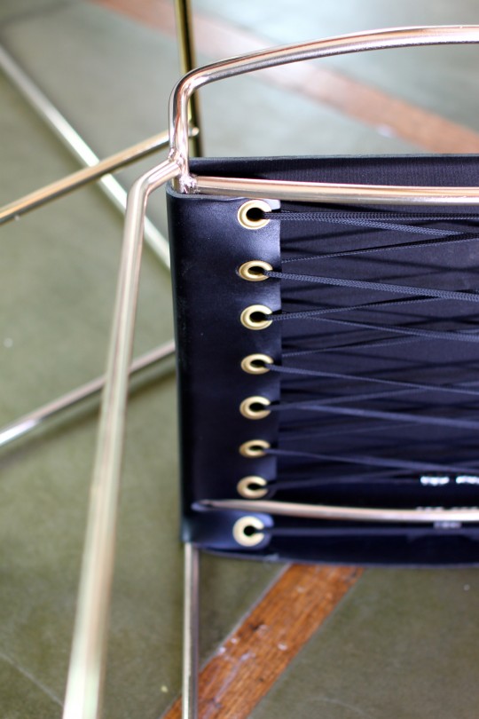
Kitchen Update: The Dining Table & Counter Stools
 Finding the right dining table and counter stools for our renovated kitchen proved to be a much harder task than expected. We wanted to preserve our home’s mid-century design without overpowering it with a table or stool style that conflicted with it. In Australia's Barbera Design bronze table and Uccio stool, we found the perfect balance between modern design and a sophisticated aesthetic that will work well with authentic mid-century chairs.
Now that they have been found and ordered, we are not so patiently awaiting their arrival. Our latest update was that the cargo ship carrying our items had docked in Los Angeles! Next stop would be Oakland. I'm anticipating another 2 to 3 weeks before they're delivered to our home, which will prompt both the table top and chair selections. Let's hope the last stages of this project go smoothly and quickly, we're all ready and eager to sit down at a table!
Decorating Decisions: To Run Or Not To Run
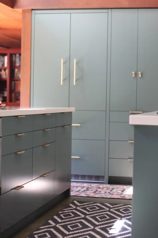
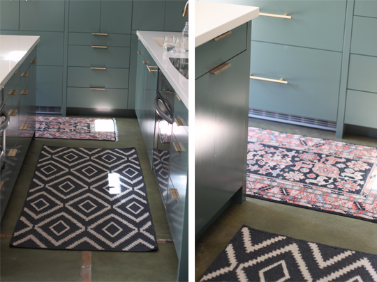
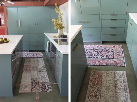
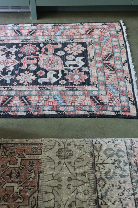
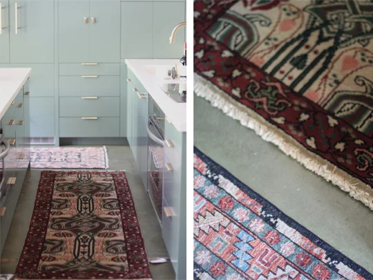
I've been searching for a runner for our 9' long kitchen island for quite some time with little luck. I'm not sure if it's a matter of not having found the right one yet or if it's a matter of 'less is more'. For practical reasons, I like having something soft underfoot while cooking while giving the floor some extra protection, but now I'm really wondering if my search should quietly end. I need your feedback as to whether or not you like the kitchen floor better with or without a runner. Also, if you happen to come across a rug/runner that you think may work, PLEASE let me know. Take a look at some of my attempts below and give me your honest opinion.
The challenge is finding the right colors and patterns to coexist with the current area rug in front of the refrigerator and pantry (the only one I truly love). HELP!!
Looking forward to your suggestions.
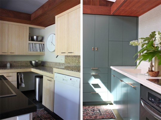
Kitchen Update: Before And After
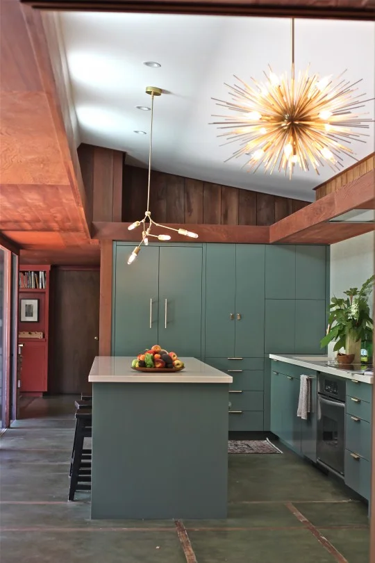
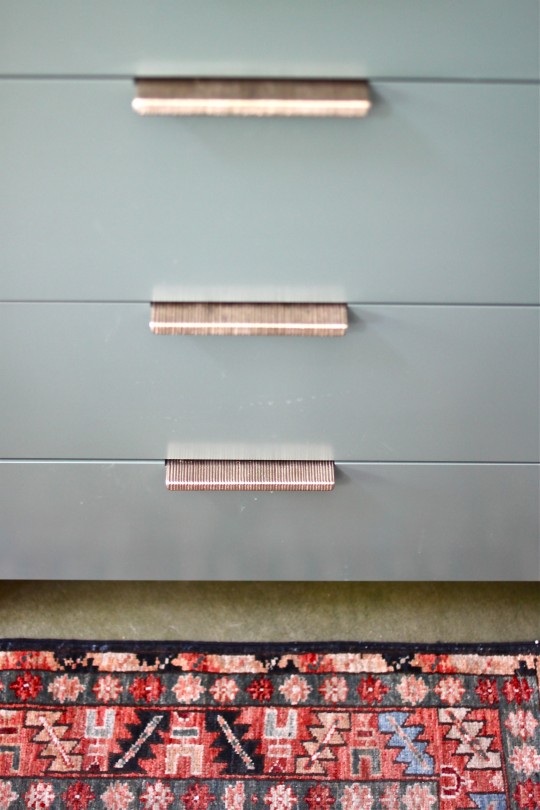
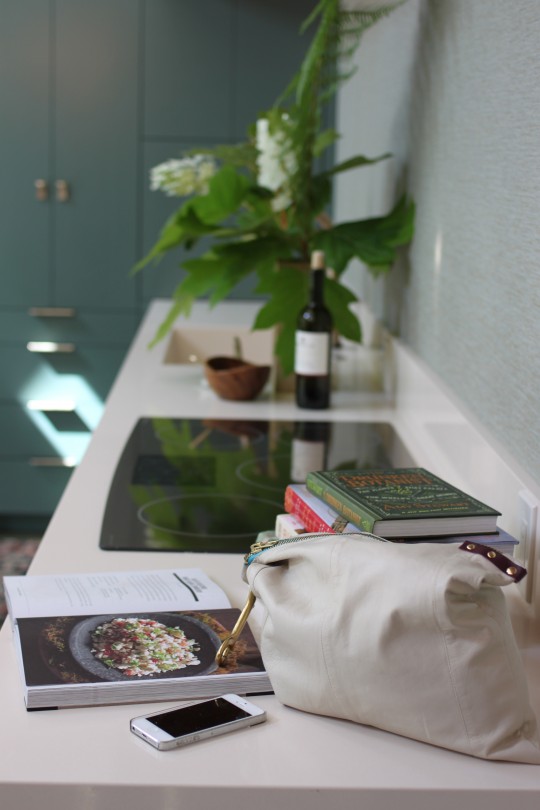
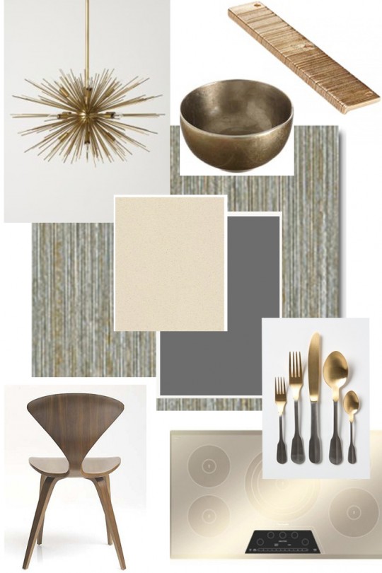
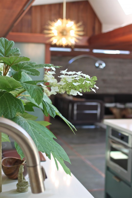 We couldn't be more overjoyed with our renovated kitchen. By carefully preserving our home's mid-century design and considering the modern day needs of a family of five, the newly created space is both functional and stylistically appropriate for that period. To honor this 1953 home, we balanced the warmth of the redwood paneling that runs through the house with a cool bluish green color palette. Texture via wall treatment and hardware tied in the organic materials used in the original construction, while brass lighting and pulls added elegance and timelessness to the renovated space. Take a look at the before and after photos:
There are still a "few" missing pieces: a table, chairs, new stools, area rugs and dishes. Once they're selected, purchased and delivered, the space will be completely done. Strangely enough, I'm not in a major rush to find these pieces, but I promise to keep you posted as I scout them out.
Here's the original "Room Inspiration" that triggered it all. I love how things fall into place...
For sourcing information please inquire below in 'comments'.
Thank you all for following us along in this adventure. Hope you enjoyed it as much as we did!
Second Kitchen Update: The Delta Faucet
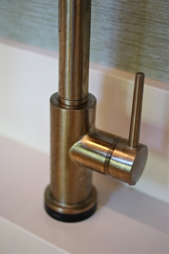
 During the past two weeks we've been getting acquainted with our brand new kitchen and I will admit we're all very pleased with the results. One of my favorite features in it (and there are many) is the new faucet. Not only does its finish work perfectly with the cabinet pulls and the color scheme, but its 'touch' feature makes it fun for our kids to fill a glass of water, rinse their dishes or wash their hands. By simply touching the spout or the handle water is immediately released. Touching it again stops the flow. I'm not usually one for gadgets, bells and whistles, but I'm super excited about the ease of use and elegant look of the Delta Single Handle Faucet . Take a look:
*This post was sponsored by Delta Faucet. The particular faucet chosen by me was a Delta Faucet donation. A big thank you to the company from all of us!
All opinions and images are my own.
instagram ◈ twitter ◈ pinterest ◈ facebook
Debra Cass Szidon
Lover of layered neutrals, mixed patterns, contrasting textures and all things botanical. My creative energies pull me in many different directions but I’m most grounded as an interior decorator, handbag designer and mother. Cocoon Home blog is where I share my reflections on family, work and my creative journey.
All content and images are property of Cocoon Home unless otherwise noted. You are welcome to use images from the blog for noncommercial use, but please credit appropriately.

