5 Kitchen Decor Ideas:


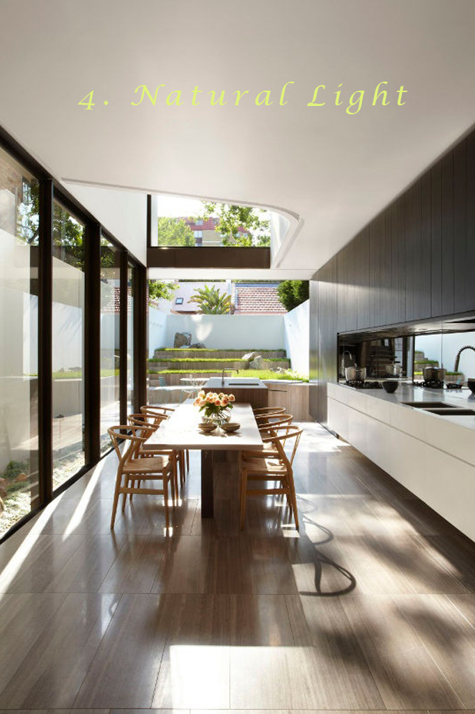
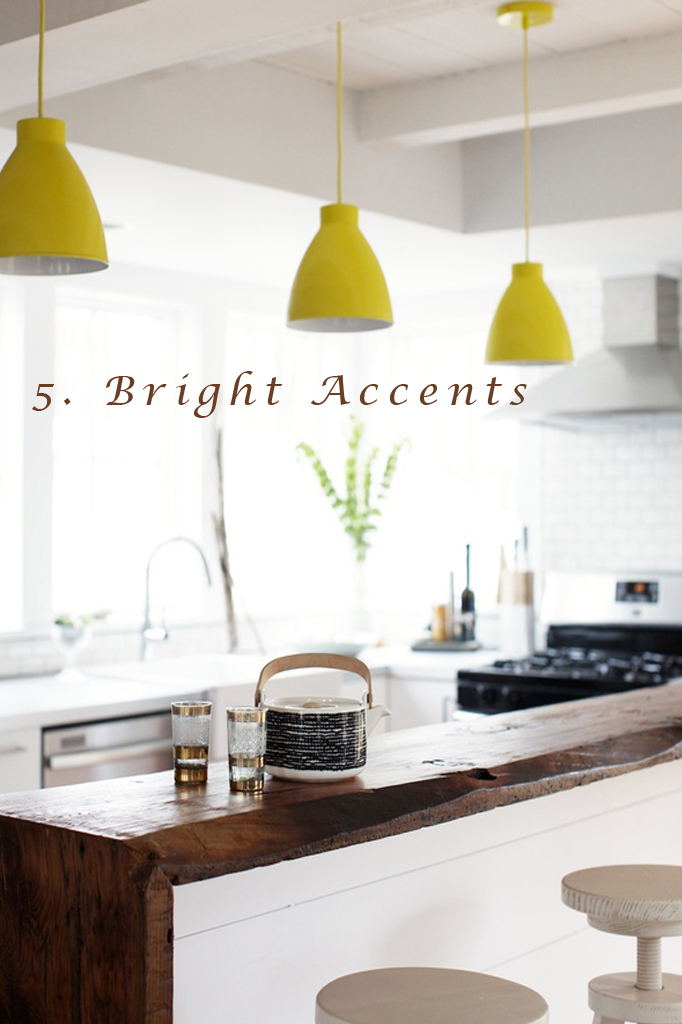
Even though I'm becoming one with the kitchen in our home, it's still not the one I dream of.  As I begin imagining a new layout, decorating ideas pop into my head.  Take a look at 5 images that feature details that I'd like to see in our redesigned kitchen (waaay in the future).

Ok, here's the breakdown on the kitchen decor:  lacquered cabinets to offset the wood walls in the house, open shelving to keep the space airy, combining elements for texture and depth, showcasing the natural light and adding pops of color for fun.

What details live in your dream kitchen?

Before And After Kitchen/Part 2: California Closets' Reader Giveaway

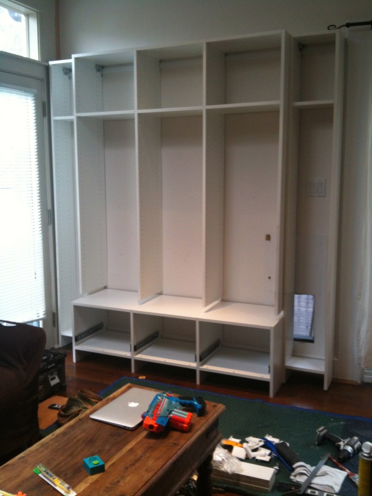
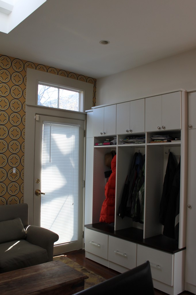
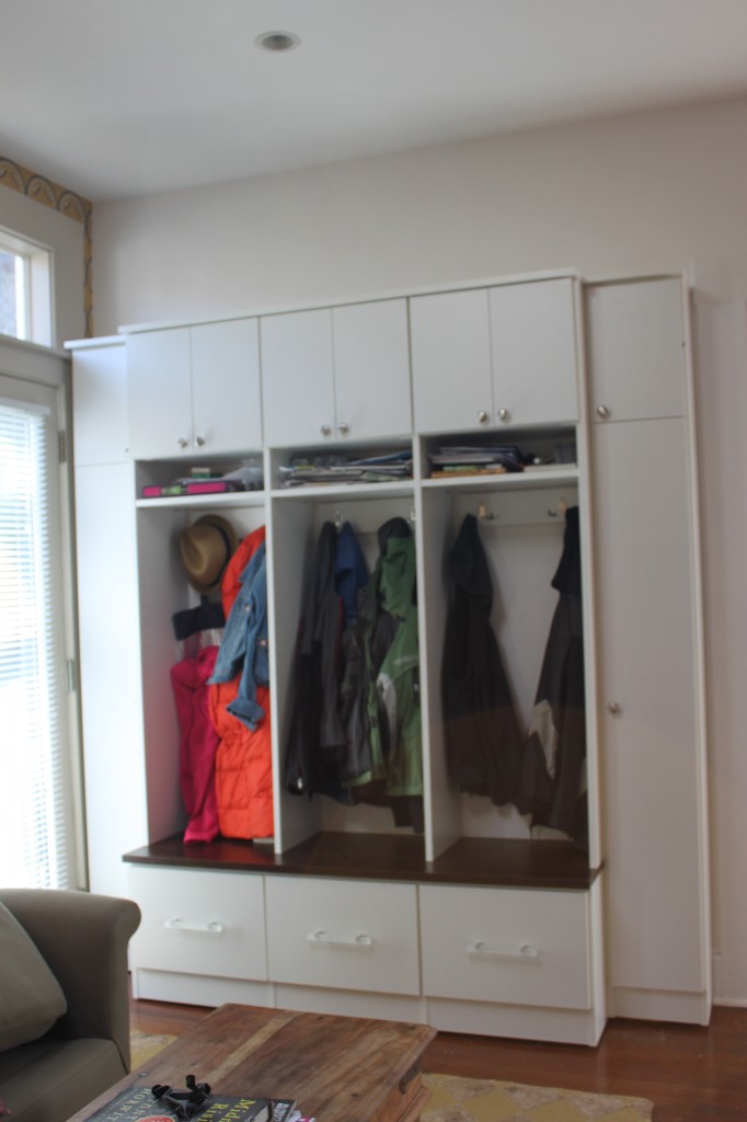
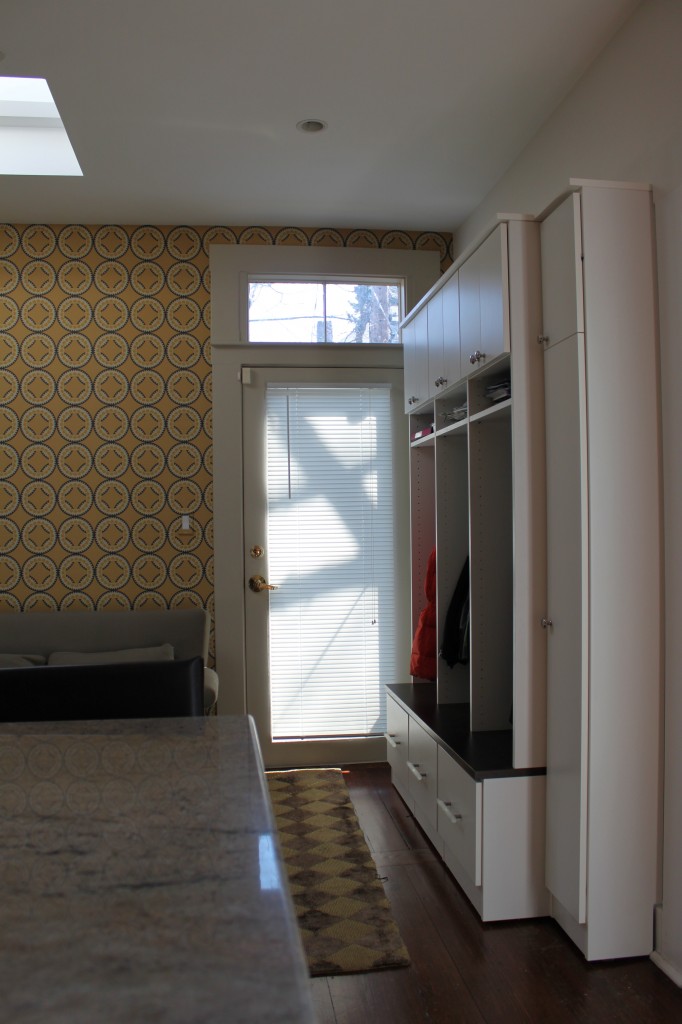
Last week , I showed you how a wallpaper and some editing updated this kitchen.  Today, you'll see how designer Ellen Gunderson of California Closets created a functional and orderly receiving area for frequently used items. With space limitations in both depth and width, the efficiently designed storage unit uses up every available inch without overbearing the rest of the room.  Three cubbies, one for each child, include 2 hooks, a drawer and a place to store papers.  Two smaller closets on either side are for mom and dad. Now everyone has a spot for his/her belongings and the area became less cluttered.  Take a look below and enter to win a $100 gift certificate from California Closets to help you organize your space.

To celebrate the success of this project,  California Closets New England is generously donating a $100 gift certificate to one of my Cocoon Home blog readers. Details below:
Whether it's your clothing, books or tools that crave organization, California Closets can help you do it.  Enter to win a $100 California Closet New England gift certificate by leaving a comment about what you'd love to see organized in your home.  Don't forget to visit and "like" both Cocoon Home Design's and  California Closets New England's  facebook page. Giveaway contest deadline is midnight Thursday April 5th.


Before And After: Kitchen/Part 1

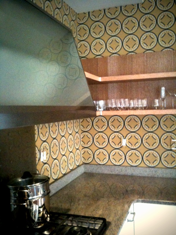
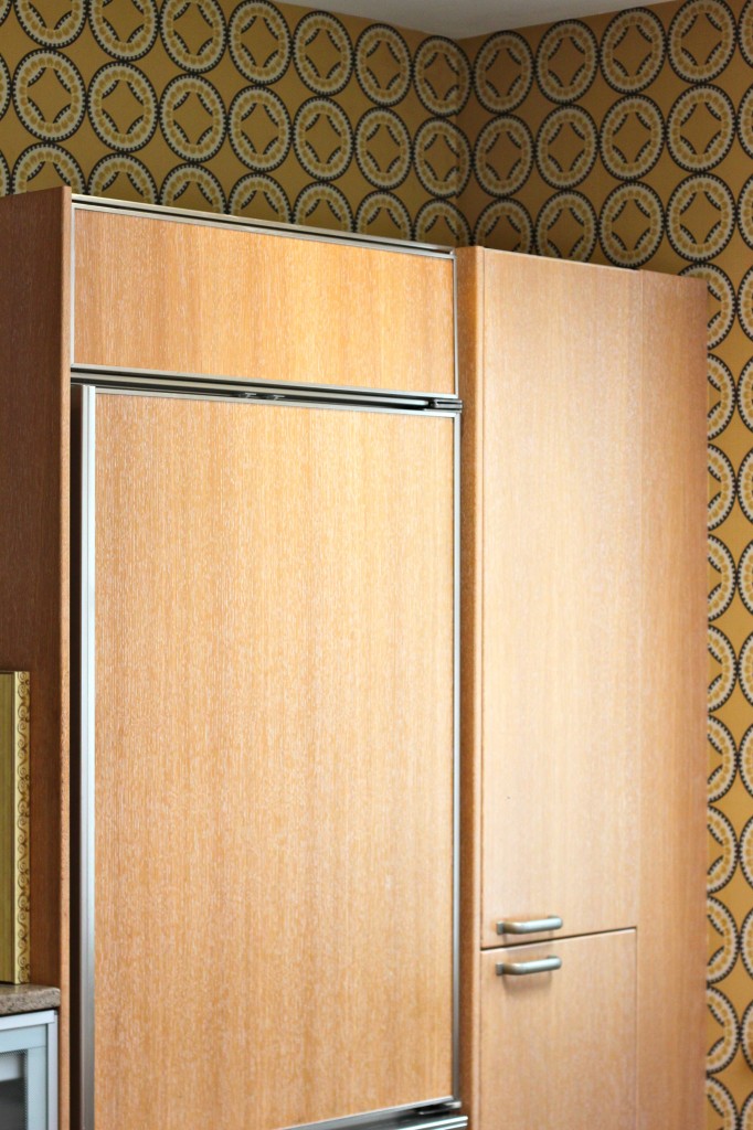
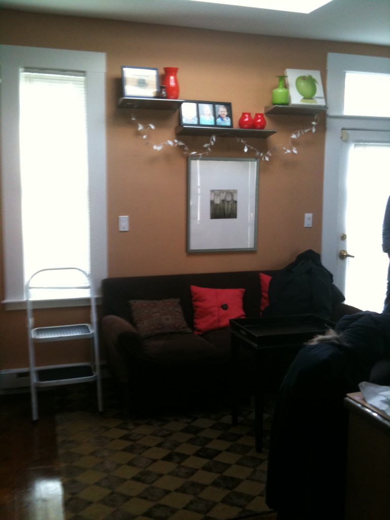
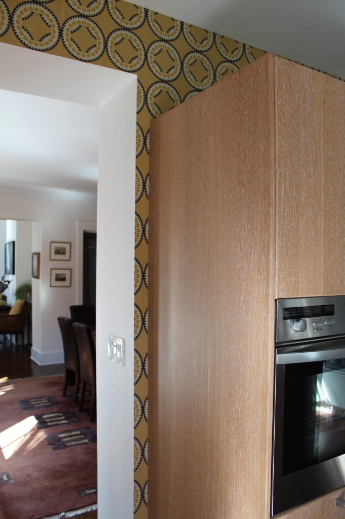
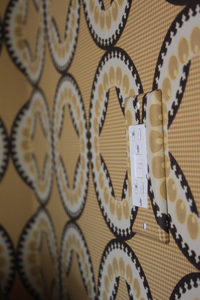
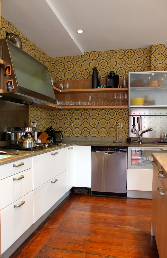
Part 1 of this Before and After reveals how Cocoon Home transformed a kitchen by repurposing its current furniture, editing and adding pattern and color.  With a sofa and comfortable counter stools in place, this family of five kitchen doubles as a place to hang, do homework and read.  Already well organized and outfitted with great cabinetry and counters,  the space needed to be brightened and updated.  Using Niesha Crosland's Moorish Circles wallpaper the kitchen area now takes on a whole new feel with a mix of bold color and pattern.  Take a look at these before and after photos.  Not only will Part 2 reveal how we managed to [aesthetically] add a mini mud room to the space,  but also feature our next reader giveaway.

Stay posted for part 2 of this kitchen's makeover and reader giveaway! 


My own before and after kitchen

This kitchen looked worse than it was.   It just needed a few changes.  First, we kept the wood counters but had them refinished the same way we did the floors in the rest of the house.   Dark ebony.  I love the warmth the wood gives to an often cool area.  We also had my dad make new front cabinets the same height as the ones against the window.  Next... new appliances, paint, and FlOR carpet tiles to cover the tile. Eventually I'll install wood flooring  or my new favorite tile from Ann Sacks, Texere.  It looks and feels like linen but is porcelain.  It comes in soft earthy tones and feels great under foot.  I will of course add radiant heat.

The space is the same as it was but easy on the eyes and easy to work in.  Everything is within arms reach.  Even the toys so i can distract the little ones while making dinner or mixing a drink.  Send me photos of your renovated kitchen.